Business
Intelligence
Traditional BI only takes you as far as correlation. AI-assisted analysis helps you drill down to cause and effect with graph-powered BI.
Reclaim the data lake and extract value from your existing data by making it easy to connect, explore, and visualize.
See past the numbers
Graph-powered
Move beyond static dashboards to AI-powered, relationship-driven intelligence. Kineviz helps you spot opportunities, risks, and emerging “black swans” by turning charts and tables into a connected graph AI can reason over. Clean and model data on the fly with visual transforms, then test hypotheses quickly—seeing not just metrics, but the relationships behind them.
Dashboard meets mind map
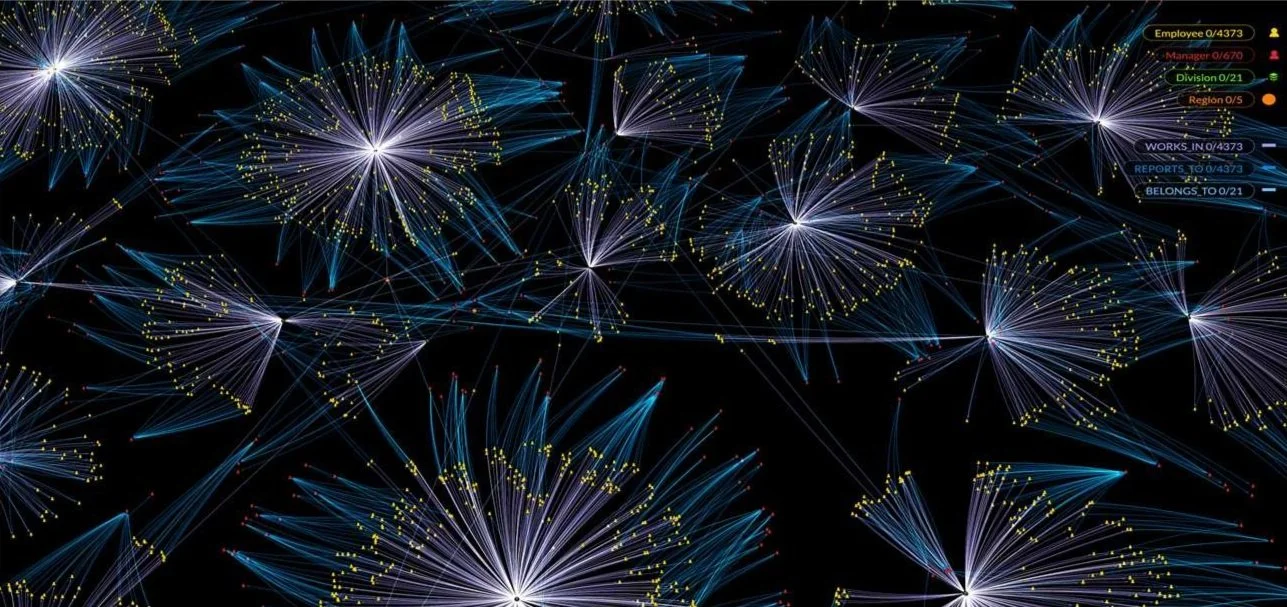
Combine structured metrics with a data model that reflects how people—and AI—reason. Kineviz connects entities, signals, and dependencies into a navigable system, letting you monitor interdependencies at the forest, tree, and leaf level. Analysts explore context, validate assumptions, and refine insights in a shared reasoning environment.
More than a pretty picture
Geospatial and time series data appear alongside connected, high-dimensional relationships in a single view. By preserving structure, Kineviz reveals clusters, paths, and causal patterns that disappear in side-by-side charts. The result: insights that are not only visible, but explainable, traceable, and ready for action.
Frequently Asked Questions
What is graph-powered business intelligence?
Graph-powered business intelligence analyzes data as a network of connected entities rather than static charts and tables, revealing the relationships behind the metrics. Kineviz turns your existing data into a connected graph that AI can reason over, so you see not just what the numbers are, but how entities, signals, and dependencies relate—surfacing opportunities, risks, and emerging "black swans."
How is graph analytics different from traditional BI dashboards?
Traditional BI aggregates data into dashboards that show what happened; graph analytics preserves the relationships between data points so you can explore why. Kineviz describes it as "dashboard meets mind map": structured metrics combined with a connected data model you can navigate at the forest, tree, and leaf level, instead of static side-by-side charts.
Can BI tools show causation instead of just correlation?
Traditional BI only takes you as far as correlation; identifying cause and effect requires analyzing the relationships between entities. Kineviz addresses this with AI-assisted, graph-powered analysis: by preserving structure, it reveals clusters, paths, and causal patterns that disappear in isolated charts, helping analysts drill down from correlated metrics to the mechanisms behind them.
How do you extract value from a data lake?
You extract value from a data lake by making its contents easy to connect, explore, and visualize—not just store. Kineviz helps teams "reclaim the data lake" by turning existing data into a connected, explorable graph, with visual transforms for cleaning and modeling data on the fly, so analysts can test hypotheses quickly without lengthy data engineering cycles.
What role does AI play in modern business intelligence?
AI's contribution to modern BI is making analysts dramatically more effective — not handing them prepackaged answers — moving analysis from static reporting to relationship-driven reasoning: finding patterns, testing hypotheses, and explaining outcomes. Kineviz turns charts and tables into a connected graph AI can reason over, within a shared reasoning environment where analysts explore context, validate assumptions, and refine insights, keeping results explainable and traceable rather than opaque.
Can you combine geospatial and time series data with network analysis in one view?
Yes—Kineviz displays geospatial and time series data alongside connected, multi-dimensional relationships in a single view. This matters because patterns spanning place, time, and relationships disappear when split across separate charts; keeping them together reveals clusters, paths, and causal patterns, producing insights that are visible, explainable, traceable, and ready for action.
How can analysts detect black swan events or hidden risks in business data?
Hidden risks and "black swans" usually emerge from interdependencies between entities, which static dashboards flatten away. Kineviz helps analysts spot them by connecting entities, signals, and dependencies into a navigable graph, letting teams monitor interdependencies across levels of detail and see emerging risk patterns in the relationships behind their metrics before they surface in headline numbers.