Kineviz
(formerly GraphXR)
Powering Insight with Intuitive Visual Analytics and AI-Assisted Discovery
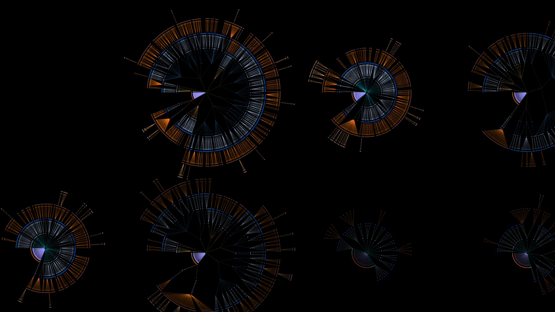
Visualize complex and hidden patterns
Put connections at the center of your analytic workflows, and enable iterative data visualization and exploration.
Use cases include:
OSINT investigations
Legal E-discovery
Anti-Money Laundering
Fighting Collusion
Exploring connected data in an immersive browser-based platform.
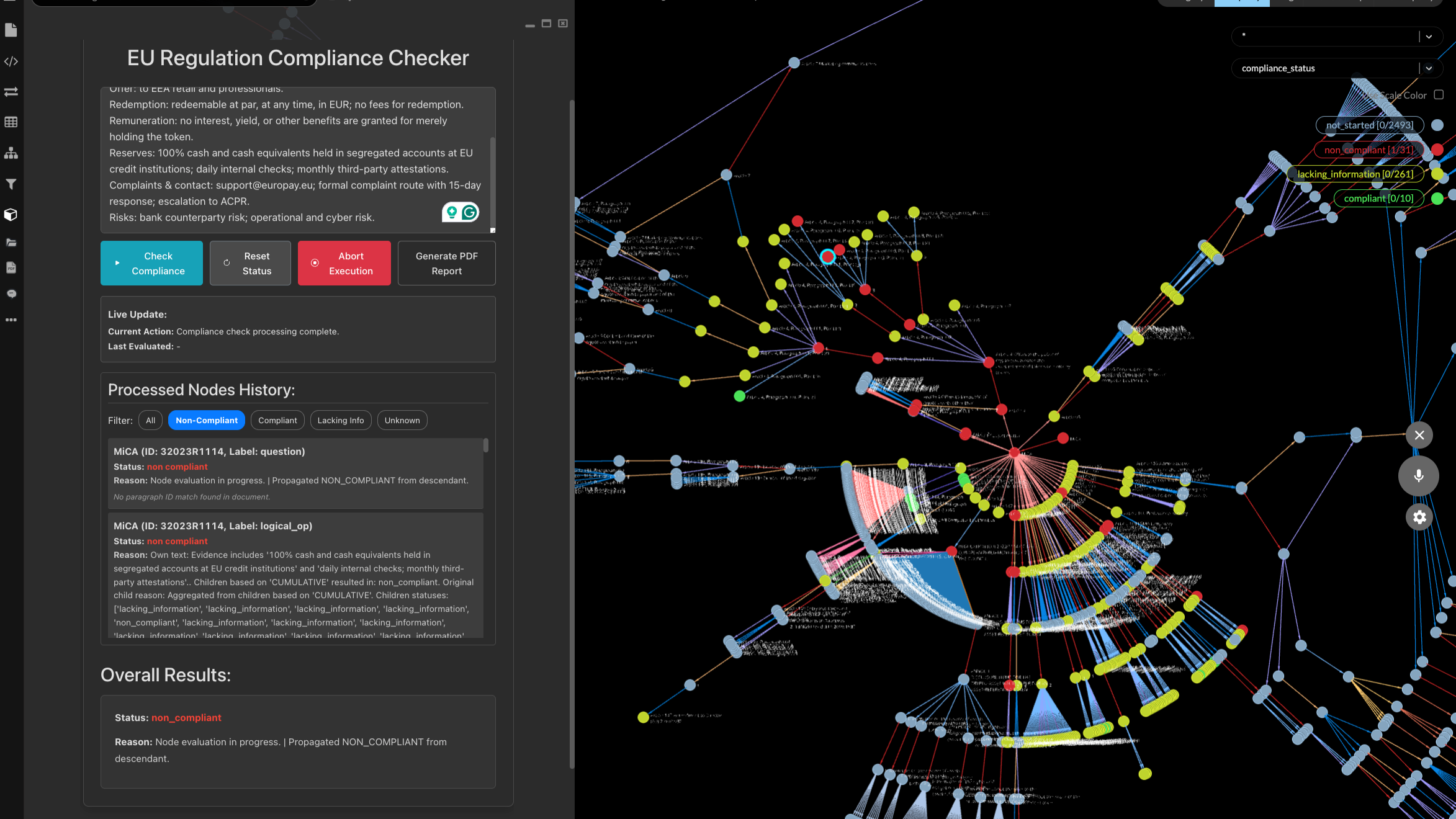
Gather and merge data for focused visualization
Fuse and transform data from a wide range of sources. Connect to and query graph and relational databases. AI-assistance makes it even easier to extract entities and relationships from CSVs and many other file formats.
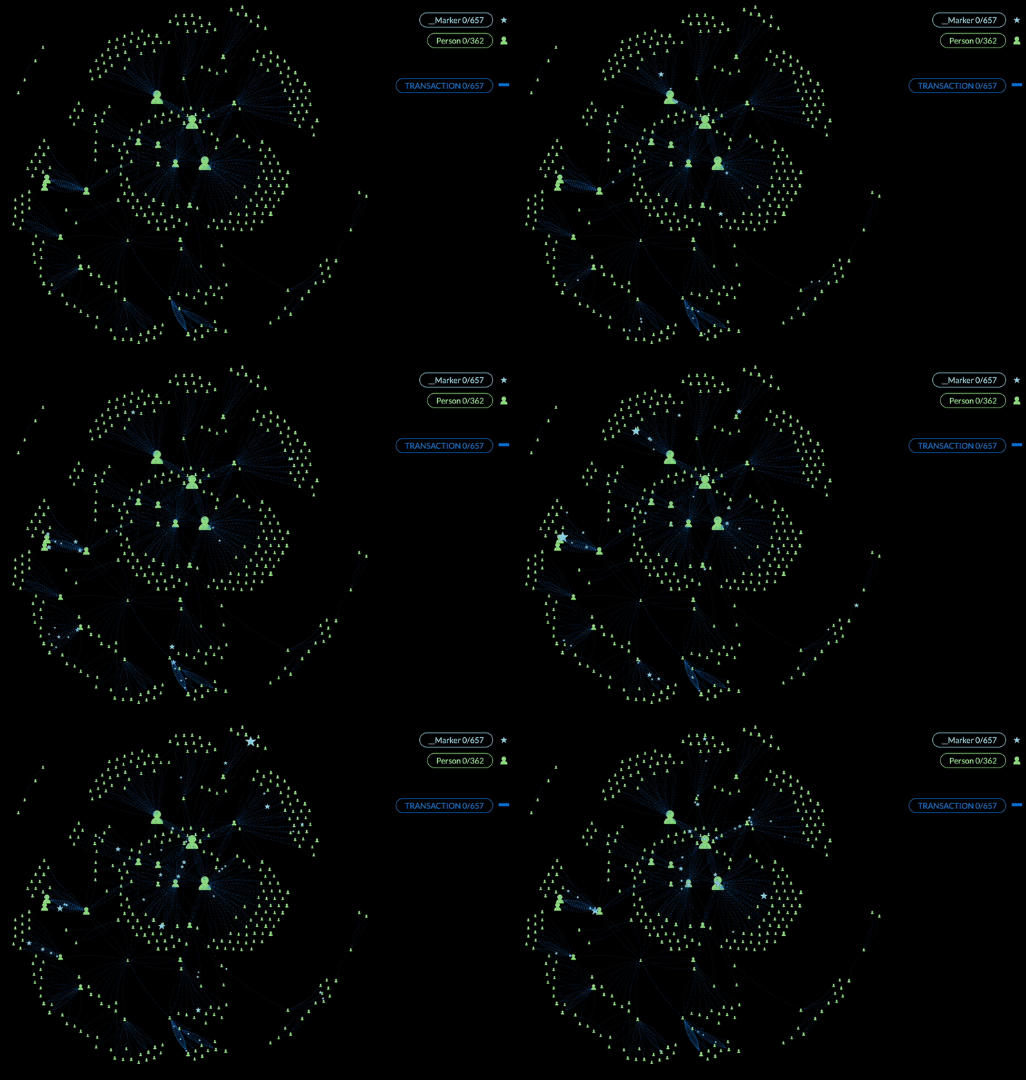
Visualize, analyze and collaborate
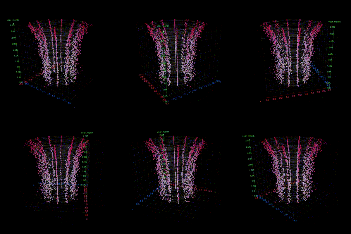
Visualization
Rapidly visualize and explore data from graph or relational databases, CSV or JSON files, and 3rd party APls. Fine-tune your graph on the fly with portrait images, icons, custom colors and layouts.
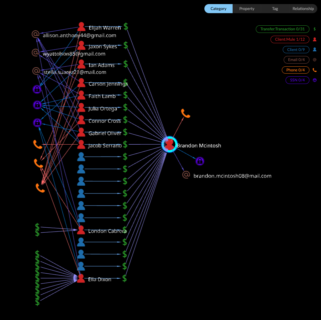
Analysis
Discover hidden connections with powerful graph analytics like path finding, centrality, and community detection. Iterate views of your connected data to support geospatial, time series, and social network analysis.
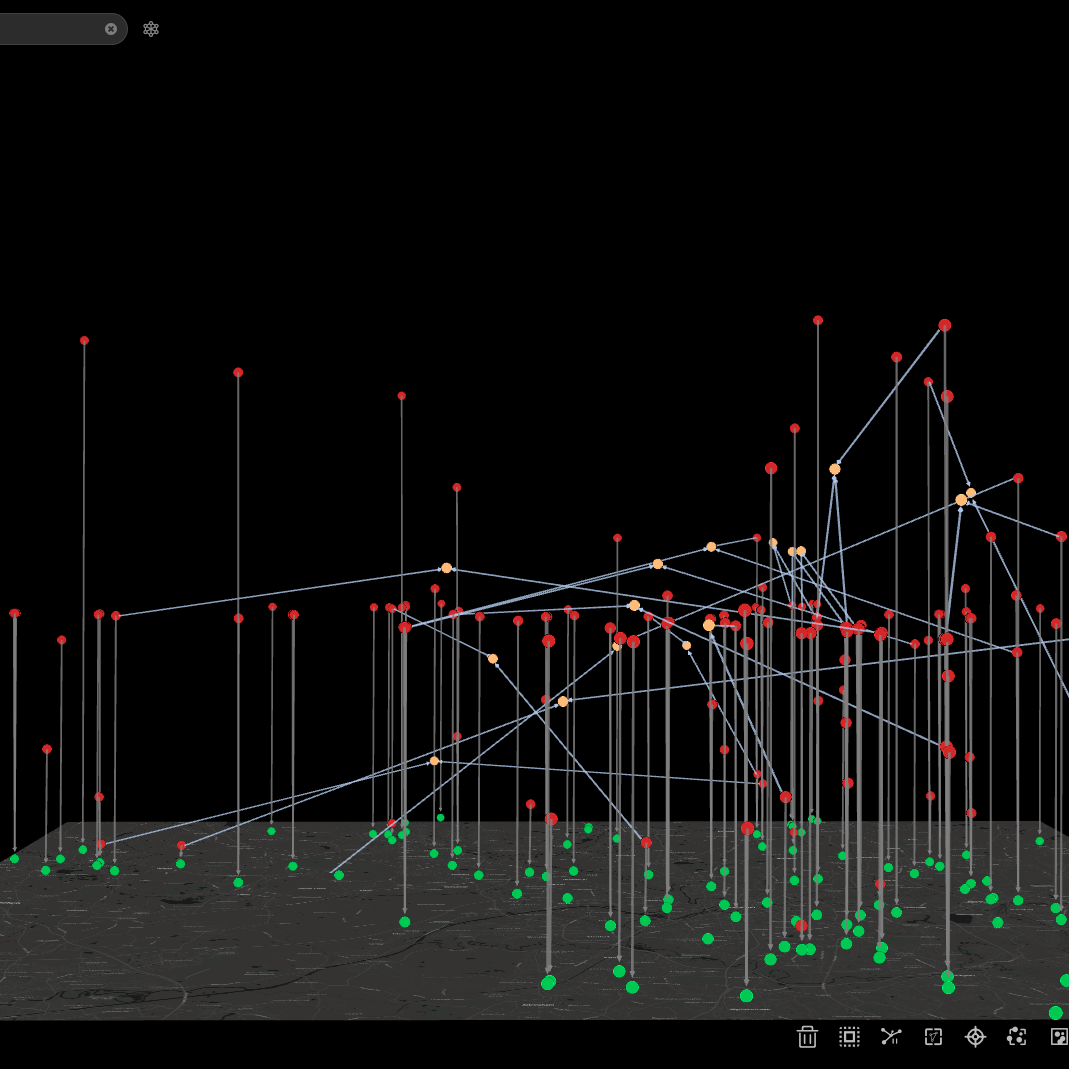
Secure Collaboration
Provide controlled access to shared projects and charts with team members and stakeholders. Enterprise deployments exist entirely inside your IT ecosystem, whether on-premises, private cloud, or even air-gapped.
Learn More
Master graph skills with our self-paced learning resources, or schedule live Kineviz training.
Frequently Asked Questions
What is GraphXR?
GraphXR, now Kineviz, is a browser-based graph visualization and analytics platform for exploring connected data. It powers insight through intuitive visual analytics and AI-assisted discovery: you can pull data from graph or relational databases, CSV or JSON files, and third-party APIs, then visualize, analyze, and collaborate on it in an immersive browser environment — no installation required.
What is a good visualization tool for Neo4j?
Kineviz (formerly GraphXR) connects directly to Neo4j and other graph databases, letting you query, visualize, and explore your graph in the browser. Beyond graph visualization, it adds graph analytics like path finding, centrality, and community detection, plus geospatial, time series, and social network views. You can fine-tune graphs on the fly with icons, portrait images, custom colors, and layouts.
What tools do OSINT investigators use for link analysis?
OSINT investigators use graph visualization platforms to map relationships between people, accounts, and events from open sources. Kineviz (formerly GraphXR) is built for exactly this: OSINT investigations are a primary use case, alongside legal e-discovery, anti-money laundering, and collusion detection. Its AI assistance extracts entities and relationships from CSVs and many other file formats, turning raw collected data into an explorable network. For the collection step itself, Kineviz offers SeekerXR, which pulls from more than 80 OSINT and proprietary data sources.
How do I visualize a knowledge graph?
You can visualize a knowledge graph by connecting a tool like Kineviz (formerly GraphXR) to your graph database or loading files directly. Kineviz connects to graph and relational databases, ingests CSV, JSON, and third-party API data, and fuses sources into one view. From there you explore interactively — iterating layouts, colors, and filters — and apply analytics such as path finding, centrality, and community detection.
What is community detection and centrality in graph analysis?
Community detection groups densely connected nodes to reveal clusters, while centrality measures identify the most influential nodes in a network. Kineviz (formerly GraphXR) includes built-in algorithms for community detection, centrality, and shortest path. Analysts combine them with geospatial, time series, and social network views to discover hidden connections in investigations like anti-money laundering, OSINT, and collusion cases.
Can graph visualization software run on-premises or air-gapped?
Yes. Kineviz (formerly GraphXR) enterprise deployments run entirely inside your own IT ecosystem — on-premises, in a private cloud, or even fully air-gapped. The platform also supports secure collaboration, providing controlled access to shared projects and charts for team members and stakeholders, which matters for law enforcement, AML, and legal e-discovery teams handling sensitive data.
How do I turn a CSV file into a graph visualization?
Kineviz (formerly GraphXR) gives you several routes from CSV to graph: hand the file to Kineviz Agent and let it build the graph, map fields to nodes and edges yourself in Graph Composer, or shape the graph step by step with visual transforms (extract, shortcut, link, merge). The platform fuses and transforms data from a wide range of sources, including CSV and JSON files, relational and graph databases, and third-party APIs, so you can merge everything into one focused, explorable visualization.
GraphXR vs Neo4j Bloom: what's the difference?
Neo4j Bloom displays the contents of a Neo4j database. Kineviz (formerly GraphXR) treats visualization as the starting point: you can analyze, transform, fuse, model, and author graphs, and do it across many data stores rather than a single database — Neo4j and other graph databases, relational databases, CSV/JSON files, and third-party APIs. Kineviz adds AI-assisted entity extraction, built-in analytics (community detection, centrality, shortest path), geospatial and time series views, and enterprise deployment options including on-premises and air-gapped environments.