Explore Your Google BigQuery Graph Using Kineviz
Discover critical connections without moving your data
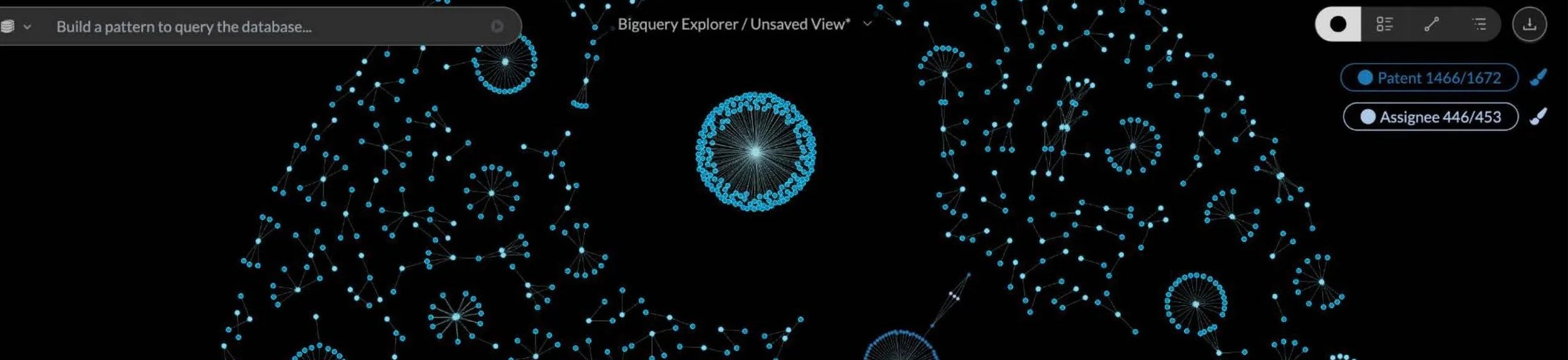
Google Cloud BigQuery Graph lets you use the analytical power of BigQuery to perform graph analysis on a massive scale. But tapping into connected data insights doesn’t require specialized graph expertise.
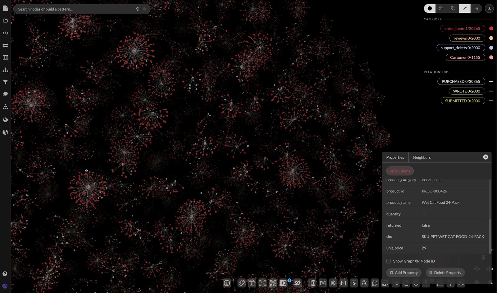
Kineviz (formerly GraphXR) connects directly to BigQuery Graph, empowering your analysts to visualize, explore, and analyze the data interactively. Your team visually navigates relationships and drills into subgraphs through low-code workflows, without needing to write any queries.
Using Kineviz, your strategy, compliance, and research teams work directly with the data and refine their analyses themselves — without waiting on engineering teams or data experts.
Together, BigQuery Graph and Kineviz give you control over your unstructured data by creating a single, streamlined workflow that makes it easier for you to uncover hidden business insights. BigQuery houses and builds the structures of the graph; Kineviz lets your analysts visually verify relationships, trace insights back to sources, and answer questions interactively.
The Challenge
Uncovering connections in your data
The majority of enterprise knowledge is locked away behind hidden connections.
Uncovering these relationships behind fraud, risk, operations, and customer insights within your enterprise data used to require specialized expertise in graph analysis. No more.
BigQuery Graph and Kineviz provide an end-to-end solution that turns graph-based reasoning, evidence-first analytics, and interactive exploration into a single, streamlined pipeline that unlocks the intelligence trapped within unstructured data. Now, connected data is accessible to your analysts, investigators, and business users who rely on it every day.
The BigQuery Graph Advantage
One platform instead of five
Most enterprise data lives in an unstructured form: reports, PDFs, emails, meeting notes, regulatory filings, memos, and more. Google Cloud cites Enterprise Strategy Group’s finding that 61% of the average organization’s data is unstructured — most of it sitting unanalyzed in archives.
In order to capture and analyze this unstructured data, traditional pipelines can be complex and sprawling. Your team has to create and maintain object storage for raw files, a custom parsing service, a separate AI extraction layer, a standalone graph database, and finally, a BI tool for data analysis. This setup is difficult to maintain and prone to multiple points of failure.
BigQuery Graph streamlines this process. Raw documents are stored in Google Cloud Storage, and text extraction, Gemini-powered inference, and graph creation all run directly within the same platform, removing the need for data movement between systems, complex service orchestration, or the accumulation of out-of-sync data copies. No bespoke infrastructure required.
The Solution
BigQuery Graph + Kineviz graph analysis
With all your data stored and processed in BigQuery, Kineviz enables your analysts to visually investigate its connections.
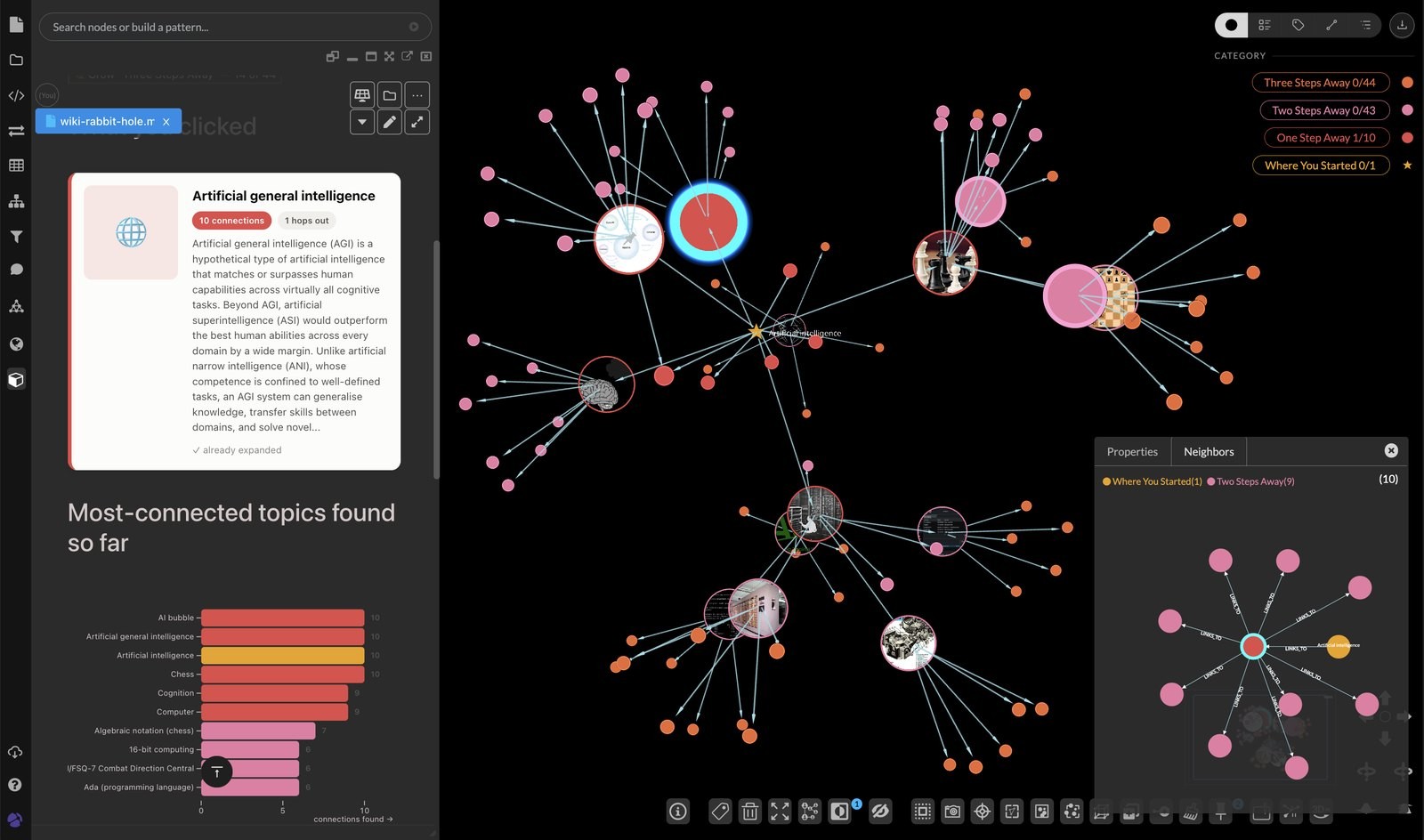
Using Kineviz, your analysts explore connected data, uncover patterns, and validate findings while tracing every insight back to its original source — all without writing complex graph queries. Because Kineviz works directly with data stored in Google BigQuery, your team analyzes connected data without moving or duplicating it, while Google Cloud remains the secure system of record.
Together, Kineviz and BigQuery Graph provide your team with:
Simplicity
Fewer systems, fewer copies — the pipeline runs in a fully-managed, integrated platform where data stored in BigQuery gets explored and analyzed in Kineviz without data movement or duplication.
Scalability
BigQuery handles millions of documents and billions of extracted facts without bespoke graph infrastructure.
Explainability
Every insight traces back to source evidence; validation is one click.
Flexibility
New questions or entity types don’t force you to rebuild the extraction model — you can just extend the schema.
Ready to get started?
Customer Impact
Real-world use cases, real-world impact
After adopting Kineviz, one gaming integrity team reduced relationship analysis from three days to 30 seconds. Visual graph analysis dramatically accelerated their investigations while keeping analysts connected to the underlying evidence that supported every conclusion.
Here are just a few more ways Kineviz customers experience the real-world impact of connected data analysis:
- Disrupted criminal networks: Kineviz helped law enforcement agencies map complex criminal networks and coordinated online activity to support large-scale investigations.
- Reduced response times: Using Kineviz shortened threat response from days to minutes for an online gaming platform processing 40 million events per day.
- Improved decision confidence: Connect every visual insight back to its original source record, helping analysts validate findings and support evidence-based decisions.

An entire extremist network deplatformed — simultaneously.

OSINT into dynamic geospatial maps for the Dutch police.

40 million events a day. Fraud caught in real time.

A small team of investigators, a faster collusion workflow.
Frequently Asked Questions
How do I visualize Google BigQuery data as a graph?
You can visualize BigQuery data as an interactive graph using GraphXR Explorer for BigQuery, a browser-based tool that connects to your Google Cloud project. Kineviz provides a step-by-step click-through guide on this page (kineviz.com/bigquerygraph): launch GraphXR Explorer for BigQuery, start from a Google Cloud project, and explore your dataset visually as connected nodes and relationships instead of rows in tables.
What is BigQuery Graph?
BigQuery Graph is Google Cloud's capability for running graph queries over data already stored in BigQuery, so you can analyze relationships without moving data to a separate graph database. Kineviz serves as the visual analysis layer for BigQuery Graph: its GraphXR Explorer for BigQuery turns query results into interactive visual graphs, letting analysts explore entities and relationships in datasets directly from their Google Cloud project.
Do I need a separate graph database to do graph analysis on BigQuery data?
No. With BigQuery Graph, your data stays in BigQuery, and GraphXR Explorer for BigQuery provides the exploration, analysis, and visualization layer on top. That means you can go from a Google Cloud project to an interactive graph view of your dataset without standing up or ETL-ing into a standalone graph database — Kineviz's guide walks through the whole flow step by step.
What is the best graph visualization tool for BigQuery?
GraphXR Explorer for BigQuery is purpose-built for visually exploring BigQuery data as a graph, and Kineviz is a Google Cloud partner serving as the visual analysis layer for BigQuery Graph. Rather than static charts, it renders your data as interactive networks of entities and relationships, with a guided step-by-step path from starting a Google Cloud project to exploring a dataset visually in Kineviz.
How do I get started exploring a BigQuery dataset in Kineviz?
Start by launching GraphXR Explorer for BigQuery, then follow the complete step-by-step click-through guide at kineviz.com/bigquerygraph/click-through. The flow is: start a Google Cloud project, connect it to Kineviz, then explore your dataset interactively as a graph. Because Kineviz runs in the browser, there's no heavyweight installation required to begin visualizing your BigQuery data.
What are common use cases for graph analytics on BigQuery data?
Graph analytics on warehouse data is most valuable where relationships matter as much as rows: fraud detection, cybersecurity, supply chain, customer 360/KYC, and healthcare are among the industries Kineviz highlights for its Google Cloud visual analytics integrations. By visualizing BigQuery data as connected entities in Kineviz, analysts can trace relationships across records that would be hard to spot in tabular query results alone.