
Ever since I was young, I dreamed of transforming Slay the Spire 2 runs into actionable business insights
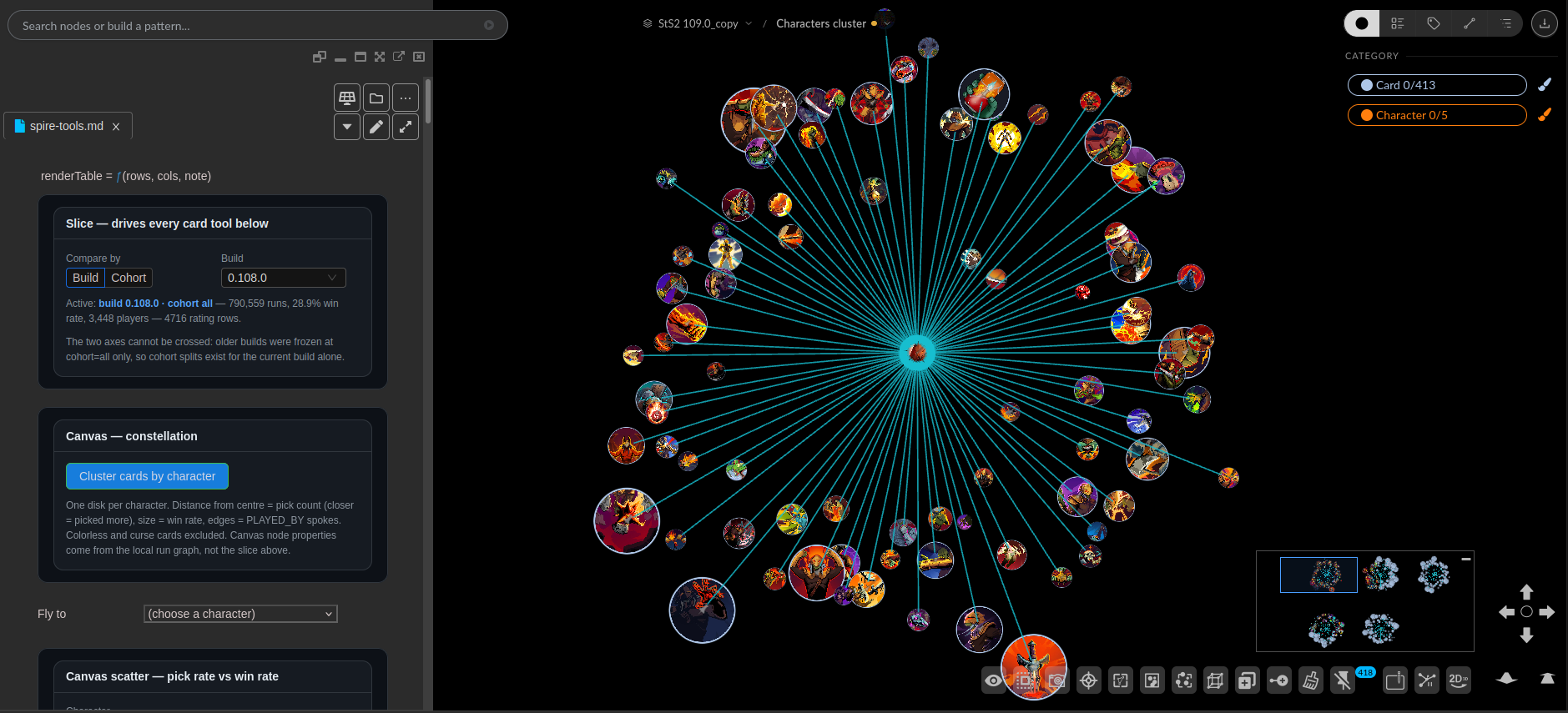
I was watching Cluster Graphs are… kind of awesome? when I figured out there was a professional overlap with my hobby. Here was a Slay the Spire streamer genuinely delighted by node clusters, hand-building the exact thing I build at Kineviz, using data from a game I have dedicated many hours into.
 (Making this image was also absolutely necessary for this post)
My first thought was that I could probably help with the parts he was fighting. My second, more honest thought was that this was the best justification I would ever get for spending work hours on Slay the Spire 2. Which is roughly how I found out that we have more StS2 players on staff than I assumed, and that “I’m doing card data research” holds up surprisingly well in a standup.
Spirebird is Jorbs’s community stats site, and at the time I extracted it, it had parsed 929,073 runs, 790,559 of them solo. Most people who visit it look at the cards tab. There are seven tabs: cards, relics, events, potions, encounters, shops, and campfires. Each one splits four ways by player count and seven ways by skill cohort.
The part a table cannot do
A sortable table answers “which card is best.” It handles that well, and Spirebird already does it.
What a table cannot answer is “which cards belong together,” because that is not in rows and columns. It is a relationship between two cards, and relationships want edges. This is the wall Jorbs hit by hand in his video: he wanted negative edges for pairs that lose together, and he wanted to size a node by rarity and play count at the same time, and neither of those fits in a spreadsheet cell.
So I gave each character a disk. Distance from the center is how often a card gets picked, so the cards you always take sit near the middle. Nothing is aggregated away, and the shape of each character’s pool becomes something you read in seconds.
The scatter shows that even clearer. Bottom right is a card players reach for and lose with. Top left is a card that wins but is not picked often.
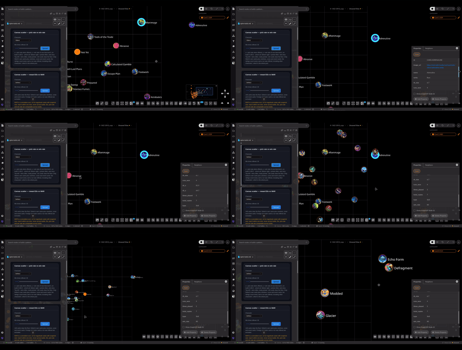
Unexpected discoveries
Building this taught me things about the data that I would not have found by reading it in a table.
In Act 3, I checked every card with at least 30 picks in both acts (422 of them) and every single one has a higher win rate in Act 3 than in Act 1. Not most, all 422, with the median climbing from 31.8% to 72.0%. Some of that is a real decision: players get pickier as the run goes on, taking 17.3% of what they are offered in Act 3 against 28.8% in Act 1, so a late pick is usually one that fits a deck already doing its thing. But that would move some cards more than others, and it does not. The whole distribution slides up together, which makes it a fact about which runs are still alive rather than a fact about cards.
The other thing I walked into myself, and it is the only one the picture caused rather than caught.
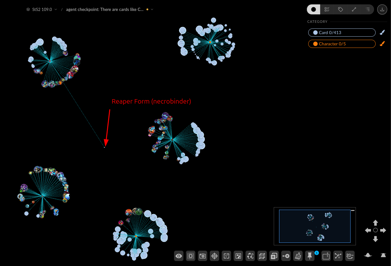
Filtering Jorbs runs I found out that Reaper Form was sitting alone, far outside the Necrobinder disk, meaning it never gets picked: one play, the lowest count in the game for his playthroughs.
Looking at the whole community, in build 0.108.0, that card was offered 26,943 times and picked 8,873, a 32.9% pick rate, which puts it in the top fifth of the Necrobinder pool. The cards players genuinely refuse are Rend and The Gambit, at 0.2%.
The beauty of graphs
I did not learn most of that from a chart I built on purpose. While tables give you answers for specific questions, graphs make you come up with new questions that you didn’t even think about before answering them.
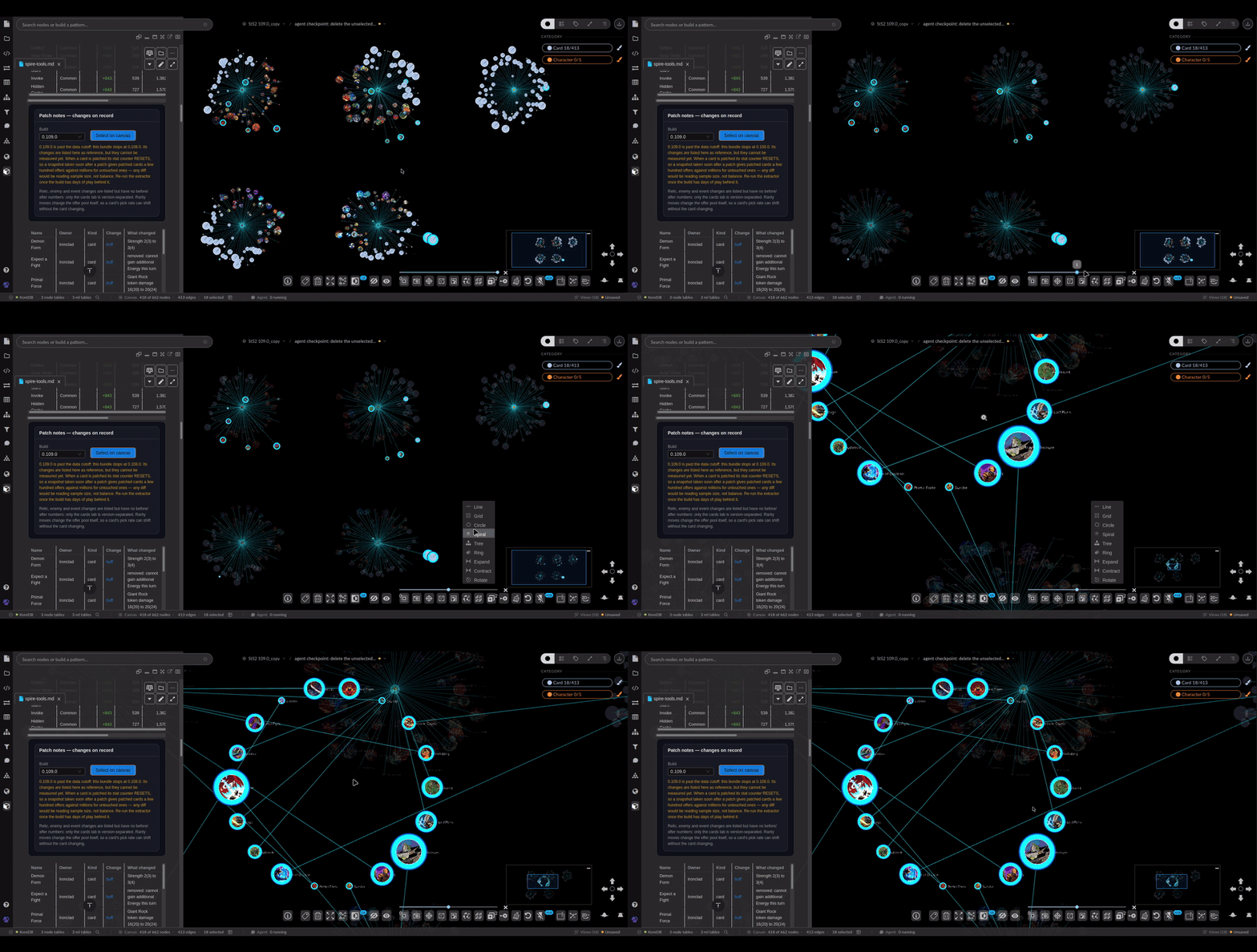 View of patched cards (0.109.0)
Let’s nerd together!
If you want to nerd out about StS2 or data visualization in general, we have a Discord Channel. I would love some feedback on this project, and if you want to try it out, reach out to me and I would love to share it.
None of this exists without Spirebird and Jorbs community that keeps it fed with runs. Thank you to everyone in there!
And if you want to explore with your own data, try Kineviz! It’s free for individual use.