Why Graph and Why Now?
Guest post by Jackie O’Dowd and Brian Higson of Realising-Potential
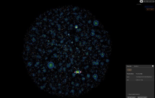
People create graph models for all sorts of reasons, to answer questions, visualise and analyse data, to better understand the relationships between things, or simply to understand the data they have in a particular context and from specific perspectives. We use it for all of these things, but most importantly we use them for sense-making, critical thinking and gaining insight.
In this paper we showcase two different models.
The first model contains data relating to Western Australian Mining Tenement holdings generated from data kindly provided by the Department of Local Government, Industry Regulation and Safety. This model which is fully self-contained, was originally created for building background and context for a particular project we were working on. It has since developed a social life all of its own. The model from which these specific views were created was aptly named “the death star” because of the initial patterns the data formed.
Why a model such as this? Kineviz models are powerful to provide understanding when we need to know it.
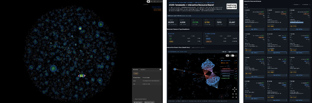
Fig 1 WA Tenements Model ‘the death star’
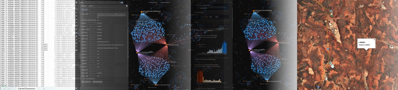
Fig 2 WA Mining Tenements from tabular data to landscape
The model shows the complicated interweave of mining licenses, tenement holdings, corporate ownership, and environmental constraints. It makes visible some 30,510 tenements, 4,034 unique holders, and 35,527 tenement/holder relationships. Tabular data was the starting point; we then move to the visualisation of specific structures in this case unique ownership and joint ventures. These views show patterns of tenements, tenement holders, and the extent of relationships and connections. We can start to see the distinction between various entities and the scale, scope, degree and type of activity. Analytics then puts meaning to the data, along with tenement geospatial positioning.
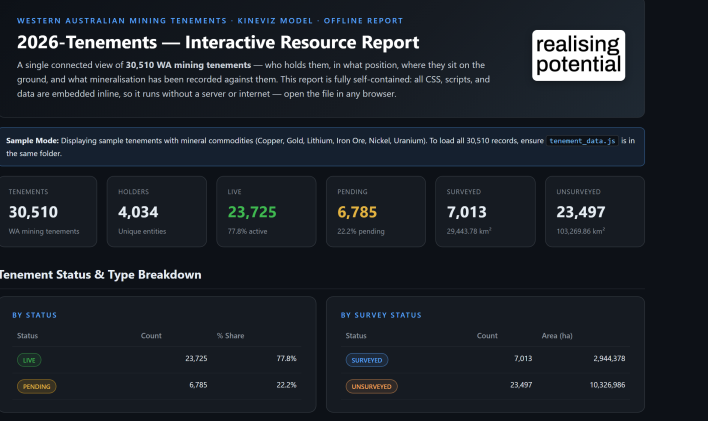
The largest tenement spans approximately 702k hectares. As mining in WA involves a complex mix of mining, law, finance, indigenous communities and regulators, this type of data visibility and analysis is incredibly valuable to the teams and individuals that use it. It improves both effectiveness and efficiency for the teams that need information in context. Instead of cross-referencing numerous spreadsheets, databases and documents, the graph model provides faster time to insight by being able to look at the data from multiple perspectives, at the time we need to know it.
In this one model alone, there are in excess of sixteen perspectives that can be navigated and explored. By being able to interact with the data in this way, stakeholders can easily navigate the complexity of the world of mining tenements. Stakeholders such as Native Title and Heritage groups can determine what types of approvals are needed or have been granted, and gain understanding of the extent and impact of mining activity on native title lands. Mining organisations can see tenement changes, holdings, opportunity, and risk, ensuring that tenement related data supports their mining plans and critical relationships.
Corporate Merger & Acquisition team activities realise value through the identification of ‘tenement blockages’ instances where a ‘strategic land holding’ opportunity arises as a tenement license owned by another party may be about to expire resulting in an acquisition opportunity. Corporate owners may simply want to know what fragmented holdings they own to enable tenement holding consolidation.
The context window can increase as data is added and the models increase in size. With this level and type of visibility both Regulators and Miners can better assess the cumulative impact of mining and its impact on ownership, revenue generation, licenses, state revenue and the environment. Models such as this can be used as computational sensors, making the who, what, where, when, how, clearer.
Data originally entered into a spreadsheet as a numerous series of rows and columns and being somewhat difficult to fathom is now through the use of graph technology, exposing hidden patterns and relationships that were previously difficult to see. It adds value to the data by putting it into context without breaking data integrity.
The Merger & Acquisition View
This second model was created as part of a M&A due-diligence process. The decision once made would be irreversible and therefore high stakes.
The targeted businesses industry was well known to the acquisition team, but the target organisation was not. The acquisition team had access to due-diligence information, mainly text based documents, system generated reports and spreadsheets. It was difficult for them to put the organisational picture together from the information they had and in a tight timeframe. We took the data available, analysed it and visualised it so the organisational structure, relationships and the various interplays could be considered.
The result is the model below which shows the organisational structure, activity, and resourcing of what can be considered a complex organisation, comprising multiple locations and thousands of people.

It was only when the data was put into a graph model that the relevant parts of the ‘context and understanding’ puzzle could be put into place, enabling the team to better understand and navigate the data in a meaningful way. Visualising and analysing the data raised the level of ‘acquisition intelligence’ as it allowed the various acquisition specialists to sense-make, critically test scenarios and reason together. They needed to understand and have transparency of the organisation and its many moving parts, what was and what was not possible. However, before they could get to that point, we needed to determine what was defined or encoded within the data, elements such as roles, locations, reporting lines, cost centres, payroll awards etc. The approach we took was to visualise the data in such a way that it was a central part of the reasoning and questioning process rather than treating it simply as the answer to a data assessment problem.
The model clearly depicted the big picture, and most importantly it helped to provide a view of the organisational dynamics. The analysis allowed exploration of ratios (number of managers and employees), and the formal dynamics, but more importantly, it highlighted the location, team, and individual connections, relationships and contribution. It provided a method to determine the type and levels of interaction between the various operating locations, something that was difficult to determine prior to visualising the data. It also started to highlight where vulnerability and risk existed and identified risks that were not on formal risk registers.
Many things shape vulnerability and risk in a merger and acquisition. It can take many forms and sometimes it is easy to see and understand, and at others less so. Vulnerability in this context can be defined as a potential weakness, a flaw or shortcoming that can exist in a process, a relationship, or at the broader system level. A risk on the other hand is the potential for loss. Being able to analyse the data from multiple perspectives and ask specific questions made vulnerability and risk clearer, allowing the team to better assess probability and question whether it mattered.
Why Graph and Why Now?
As can be seen by the models we have used here, graph technology brings the data to life. Immediately, patterns become obvious, specific elements take our attention, and we can quickly distil things of interest. The model allows the user to interact with the data, to analyse it, navigate relationships, challenge and question. It provides a vehicle for sense-making and critical thinking; it allows the user to understand the data relationally in a single connected view.
When data is visualised, it allows knowledge to be created and shared and for insights to emerge, some obvious, some non-obvious. We get to learn where things connect and to look at things differently by changing views, asking questions, clarifying and challenging.
In a world of increasing data volumes, we need ways to better access it, make sense of it and use it to create and share knowledge. Our experience has been that graph models are an effective method of realising the potential of organisational data and building capability through knowledge.
The combination of graph and AI technologies makes for a powerful toolset. Combined, they open up a world of problem-solving opportunity and capability for every business.
© Realising-Potential Pty Ltd